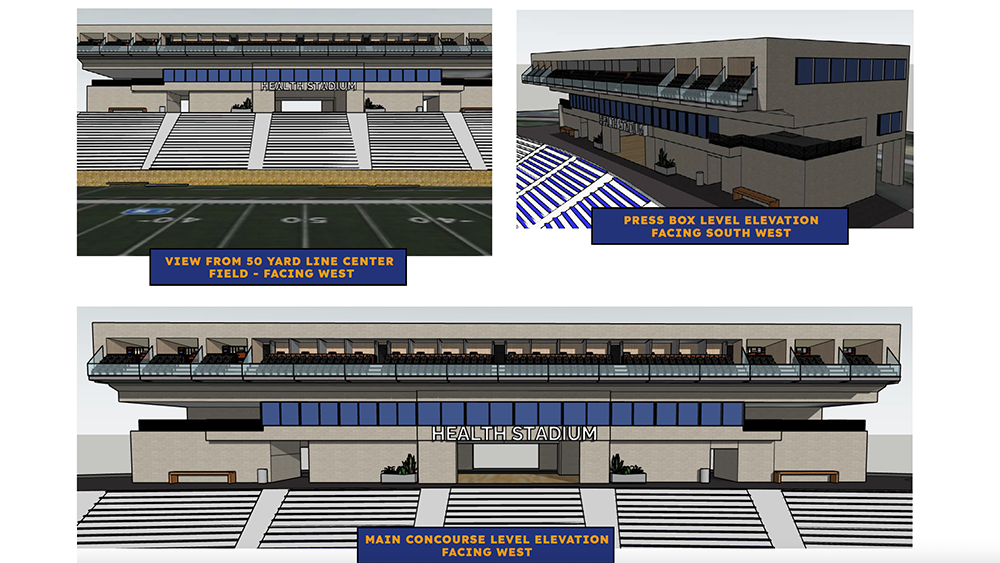
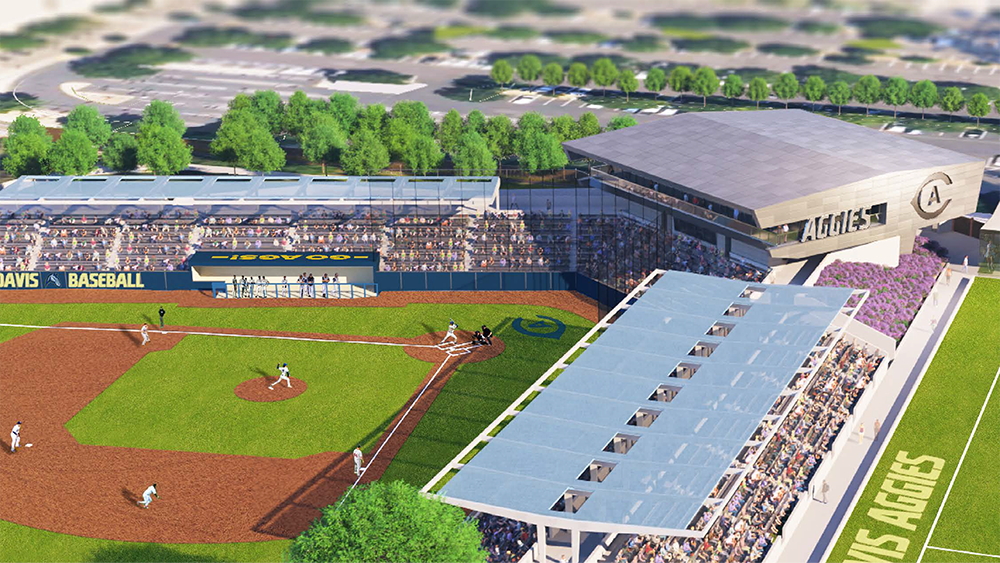
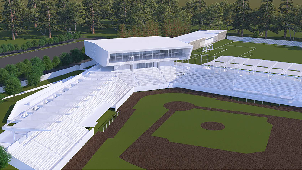
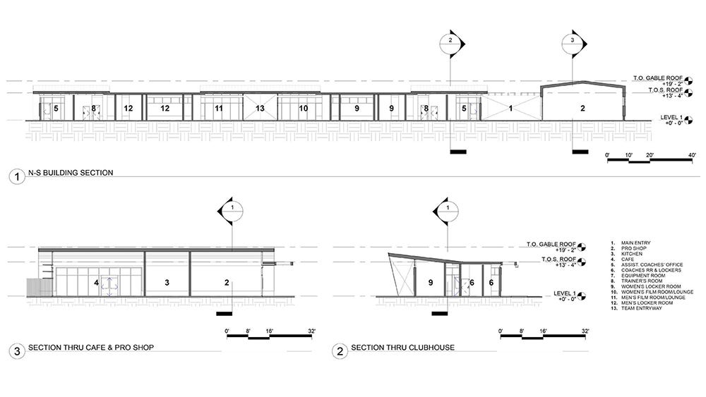
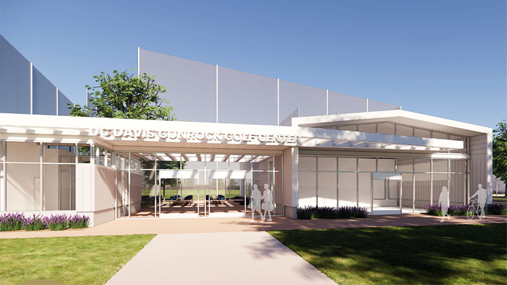
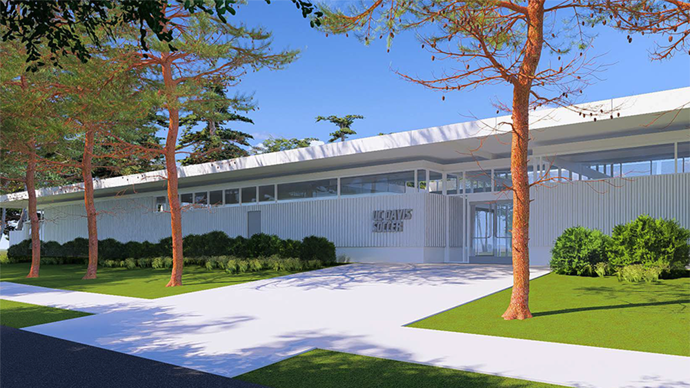
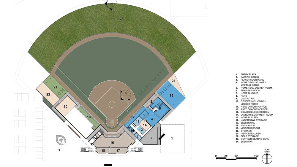
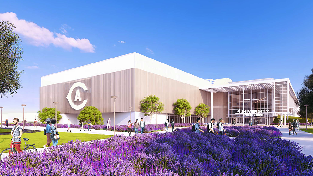
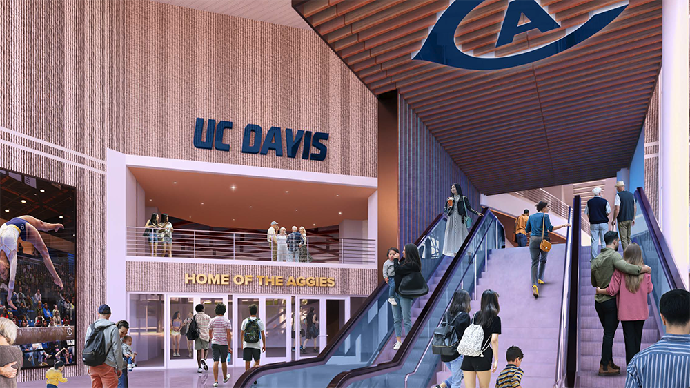
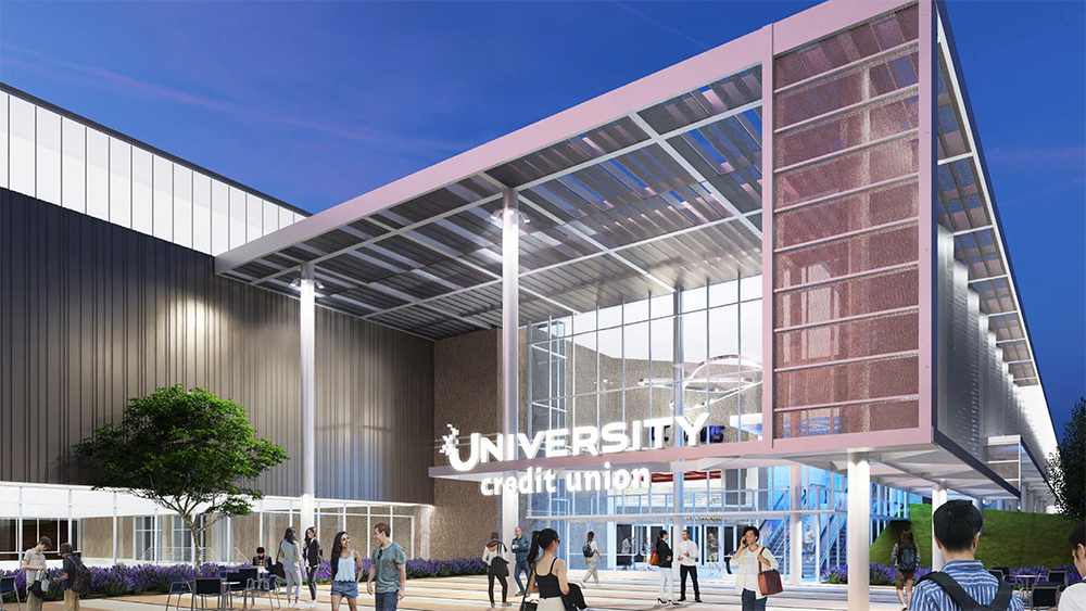
Good stuff, although they should be careful about incorporating the current logo and typeface into the actual structure of that baseball press box. There's simply no telling if/when the department opts to rebrand. Changing signage is easy. Changing the actual concrete that forms the structure of a building will not be.
The university has already gone through this. The campus used Futura as its official sans serif font for decades before switching to Proxima Nova a few years ago. Any building that came up in the 1980s into the 2010s has the Futura typeface to identify it, with the ARC and the Memorial Union being among the most prominent. When Chemistry 194 was renamed in memory of Dr. Rock in 2012, the signage across the top is in Futura. Swapping out all of that lettering around the campus would be cost-prohibitive, so StratComm simply allowed for an exception in the use of Futura in the brand guide.
Oddly, the main UC Davis campus logo used two fonts that have been discontinued per the brand guide: the UC is in a stylized Berkeley Black, even though the university switched to Freight Text; while the DAVIS is in modified Futura Black (rather than Proxima Nova). And for all the work Jan Conroy and his staff did to get people out of the habit of calling us UCD rather than UC Davis (since UCD is University College Dublin), the main campus website now has "UCD" in its favicon.
Bottom line: this stuff changes and evolves relatively quickly, often across periods that are much shorter than the lifespan of a building, so the athletics department should tread carefully with this part of its facilities plan.
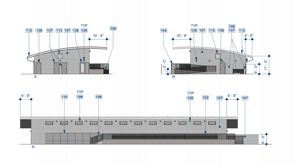
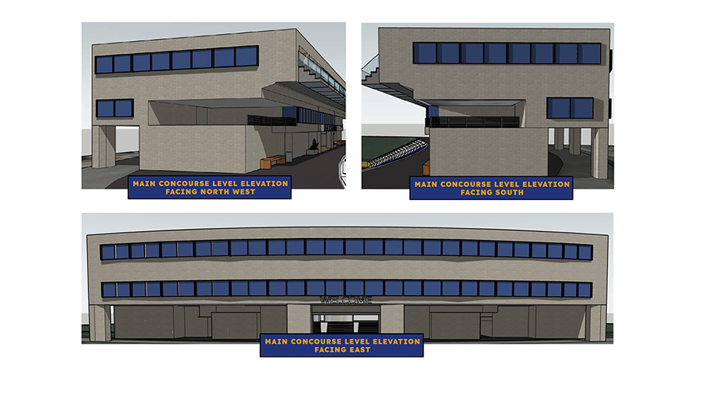
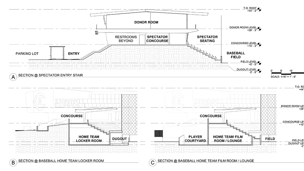
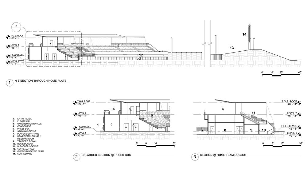
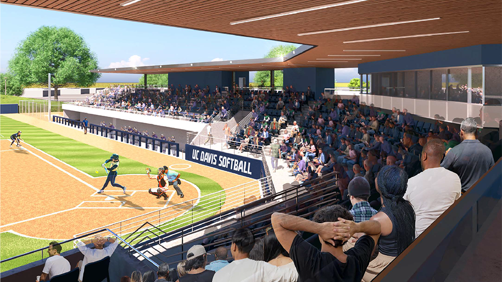
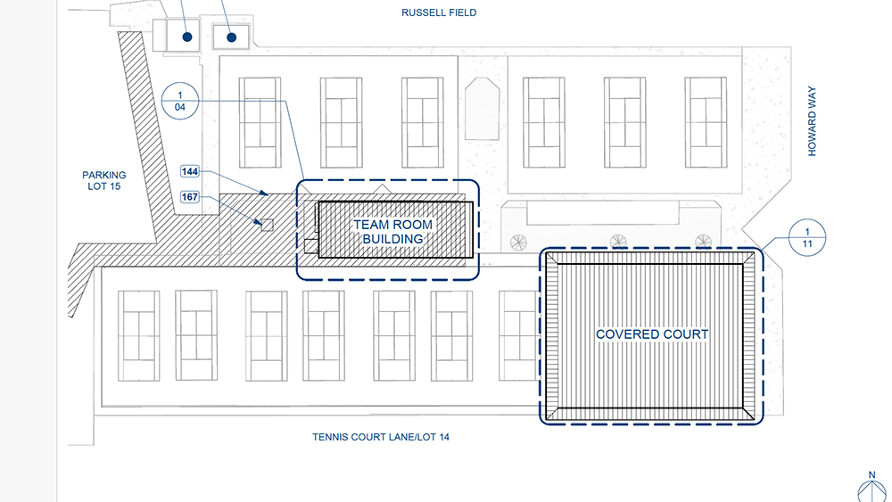
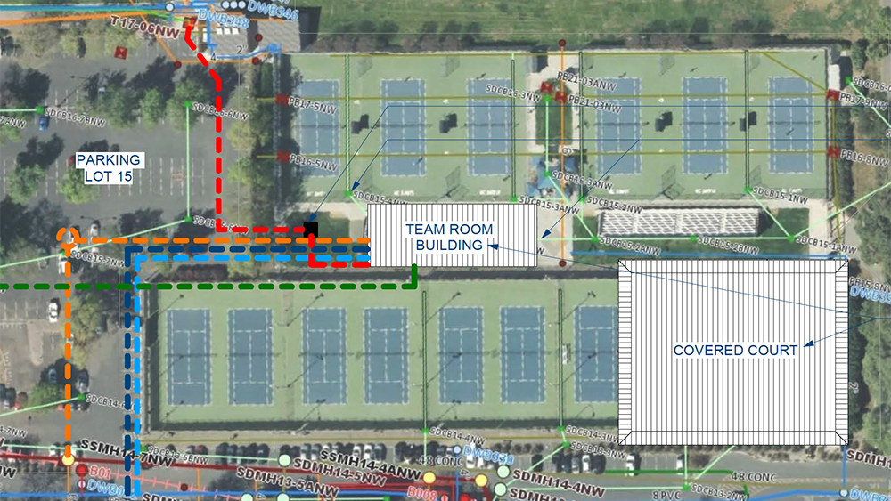
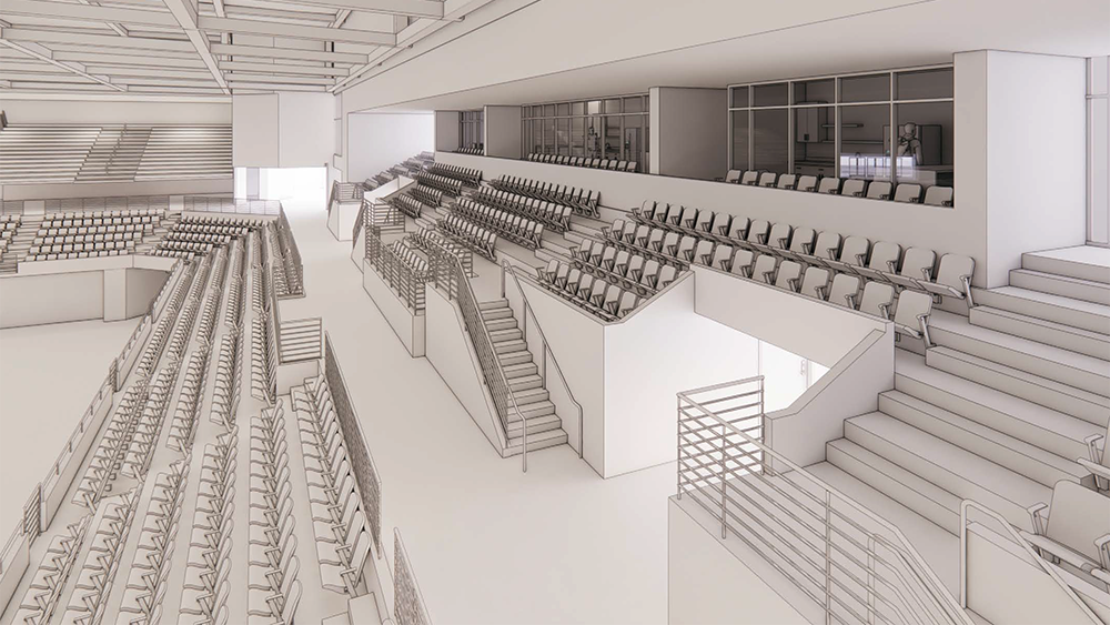
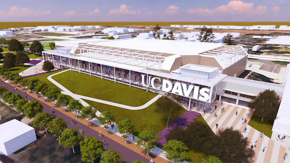
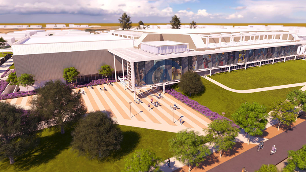
Shade for the fans in the stands is most appreciated.